


Brand and press kit
Flicker brand and logo
The logo, the emblem, the colours, the typeface and the facts, for articles, integrations, partner pages and coverage. Every file here is final artwork: use it as it is.
The logo or the emblem, never both
FLICKER is the logo. The emblem stands in for it only where there is room for just a square. Never set the two side by side or stacked: the F already carries the emblem.

Logo on black
White. The default wherever the name fits: website headers, documents, store listings, film end cards.

Logo on paper
Black, for paper, white and other light grounds, and for print.

Emblem on black
White, for square spaces only: app icon, favicon, social avatar, loader.

Emblem on paper
Black, for square spaces on light grounds.
Clear space and minimum size
Keep half the cap height clear on every side. Nothing else enters that space.
Logo


- Minimum on screen
- 10 px cap height
- Minimum in print
- 4 mm cap height
- Use the small file at
- 16 px cap height and below
Emblem


- Minimum on screen
- 16 px square
- Minimum in print
- 5 mm square
- Use the small file at
- 32 px and below
Using the marks
Do
- Use the files as they are, SVG wherever you can.
- Use white on black and dark grounds, black on paper, white and light grounds.
- Keep half the cap height clear on every side.
- Switch to the small files at small sizes.
- Link the logo to flicker.finance when you use it on the web.
Don't
- Don't redraw or retype the logo: it is custom lettering, not a font, and is never set in lowercase.
- Don't set the emblem beside the logo or stack it above it.
- Don't put the emblem in place of the F. It reads as LICKER.
- Don't recolour the marks: they are black or white only, never gold.
- Don't stretch, squash, rotate or outline them, or add shadows or other effects.
- Don't set them on busy or low-contrast grounds.
Colour
Black is the product's ground; paper is the ground for story pages, email and film. Gold is the one accent, used once per view. Green and red mean gain and loss only. The logo itself stays black or white.
On black
Ground
The page itself
#000000
color. black. ground Surface
Cards and panels
#0F0F10
color. black. surface Ink
Text
#F2F1EE
color. black. ink Secondary text
Supporting text
#A6A6A6
color. black. text-secondary Gold
The accent, once per view
#D9A75C
color. black. gold Violet
Elite and Pilot only
#B58BF9
color. black. violet Gain
Gains, buy zones, up moves
#45E499
color. black. gain Loss
Losses, sell zones, down moves
#E94646
color. black. loss
On paper
Ground
The page itself
#FAF9F6
color. paper. ground Surface
Cards and panels
#F1EFE9
color. paper. surface Ink
Text
#17181A
color. paper. ink Secondary text
Supporting text
#55585E
color. paper. text-secondary Gold
The accent, once per view
#8E6314
color. paper. gold Violet
Elite and Pilot only
#7F57B9
color. paper. violet Gain
Gains, buy zones, up moves
#007948
color. paper. gain Loss
Losses, sell zones, down moves
#C51E21
color. paper. loss
Typeface
Golos Text on every surface, one family in several roles. Numbers that line up use tabular figures.
- Weight 400
- Weight 500
- Weight 600
- Weight 700
- Weight 800
Display heading56 px · weight 800
Know when you'd sell before you buy.
Title 132 px · weight 700
Know when you'd sell before you buy.
Title 224 px · weight 700
Know when you'd sell before you buy.
Title 318 px · weight 600
Know when you'd sell before you buy.
Lead16 px · weight 400
Know when you'd sell before you buy.
Body14 px · weight 400
Know when you'd sell before you buy.
Caption12 px · weight 500
Know when you'd sell before you buy.
Golos Text is free under the SIL Open Font License. Get Golos Text
How Flicker sounds
A calm analyst who shows you the way out first.
Calm
Short sentences, no urgency, no exclamation marks.
Plain
Every term a beginner meets is common or explained in place. The numbers stay exact.
Exact
Levels, dates and conditions, never outcomes.
On your side
Waiting is a valid answer. Flicker reads; the reader decides.
Lines you can quote
- Main line
- Know when you'd sell before you buy.
- What it gives you
- A verdict, its reasons, and the exit before the entry.
- In longer copy
- We analyze. You decide. We never trade for you.
Writing about Flicker
- Write the name as Flicker. The capitals belong to the logo artwork, not to the spelling.
- Flicker reads, marks, checks, alerts and explains. It never places trades for its users.
- It makes no promise of returns or results. Its analysis is not investment advice.
- AI writes the read in plain words. The verdict, the zones and the stops are computed.
Press facts
The figures below come from the same sources as the about page.
- Name
- Flicker, also written Flicker Finance
- Based in
- Armenia
- Legal status
- Operated by Onik Sahakyan, individual entrepreneur registered in Armenia
- Markets
- Cryptocurrencies, US stocks and ETFs, and the major currency pairs
- Exchanges we read
- 16
- Platforms
- Web · iOS · Android · REST API · MCP server with 39 tools · 6 website widgets
- Languages
- 7 languages
- Website
- flicker.finance
- Press contact
- [email protected]
Flicker reads coins and stocks and gives each one a verdict, its reasons, and the exit before the entry. It runs on the web, on iOS and Android, and through a REST API and an MCP server. The web and the apps are mostly free with no account; the API and the MCP server need a free one.
Downloads
Final files, generated from one geometry source. SVG for screens, PNG where a tool needs pixels.
Logo
Wherever there is room for the name. Transparent, or on its own ground.
- White on black
- SVGPNG, 1,024 px widePNG, 2,048 px wide
- Black on white
- SVGPNG, 1,024 px widePNG, 2,048 px wide
Logo, small
For 16 px cap height and below.
Emblem
Square spaces: icon, avatar, loader. Transparent, or on its own ground.
- White on black
- SVGPNG, 512 px widePNG, 1,024 px wide
- Black on white
- SVGPNG, 512 px widePNG, 1,024 px wide
Emblem, small masters
Redrawn on the pixel grid for favicons and tab icons, at 32 px and below.
Social avatar
The white emblem on black, 1,024 px square.
- White on black
- SVGPNG, 1,024 px wide
Social covers
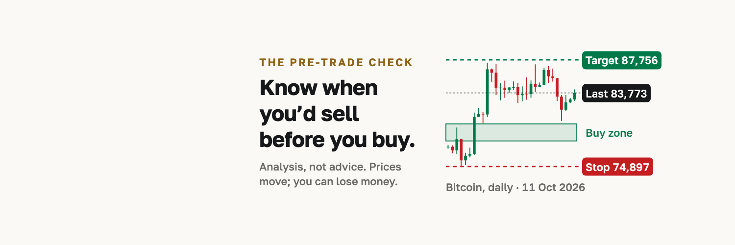
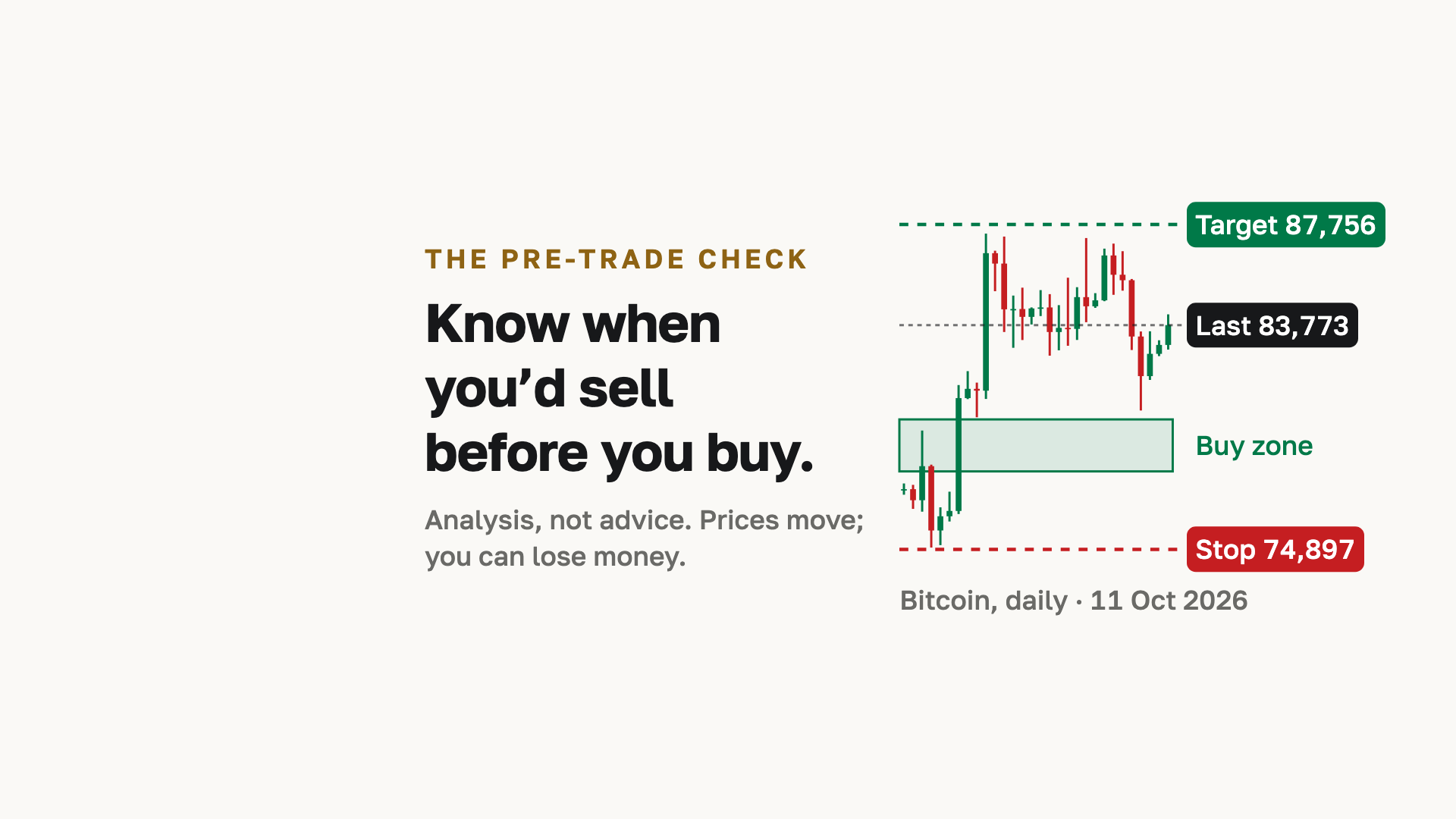
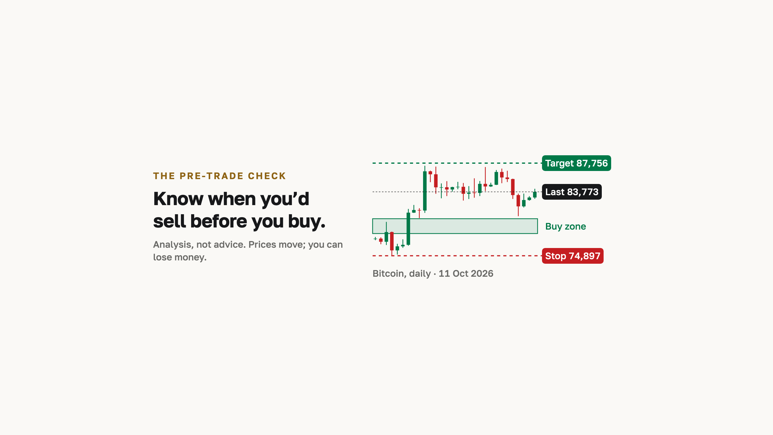
On paper, in English: the main line and the risk line beside a dated Bitcoin read, inside each platform's safe area.
- X header
- PNG, 1,500 × 500 px
- LinkedIn cover
- PNG, 1,512 × 256 px
- Facebook cover
- PNG, 1,920 × 1,080 px
- YouTube banner
- PNG, 2,560 × 1,440 px
Logo sting
The emblem becoming the logo in 2.6 seconds. For opening or closing films and brand videos, never as a transition inside a product.























Approvals and press questions
Email us before using the marks on co-branded material, or if you need a format that isn't here. Press questions go to the same address. We reply within a few hours on weekdays.